Rethinking the
Homepage at Lenskart.
Starting with friction
Over the years, Lenskart’s homepage had become... familiar. Too familiar.
Banners blended into the background. A grid that didn’t spark curiosity.
A search bar that felt more like a buried feature than a tool. And a bottom nav that existed, but didn’t really help.
Familiarity breeds comfort, sure — but it also hides inefficiency.
We asked ourselves: what’s the job of the homepage, really?
Our answer: aspire, persuade, and simplify.
The signals were LOUD.
We turned to data. It didn’t whisper — it screamed.
Low CTRs on key homepage tiles
A visible drop in search usage
Conversions lost to deep-buried categories like Women and Kids
High-intent users bypassing Home entirely via direct links
We weren’t inspiring. We weren’t guiding.
The homepage wasn’t pulling its weight.
The Problems we saw


The goals were clear.
We set six anchors to hold our redesign together:Not just a visual makeover — this was about making Home relevant again.
01
Increase Completion
Home to PLP
02
Bottom Navigation
For Faster Journeys
03
Highlight New
Launches & Exclusives
05
Structure to Eliminate
Banner Blindness
04
Design for
Multiple Intents
06
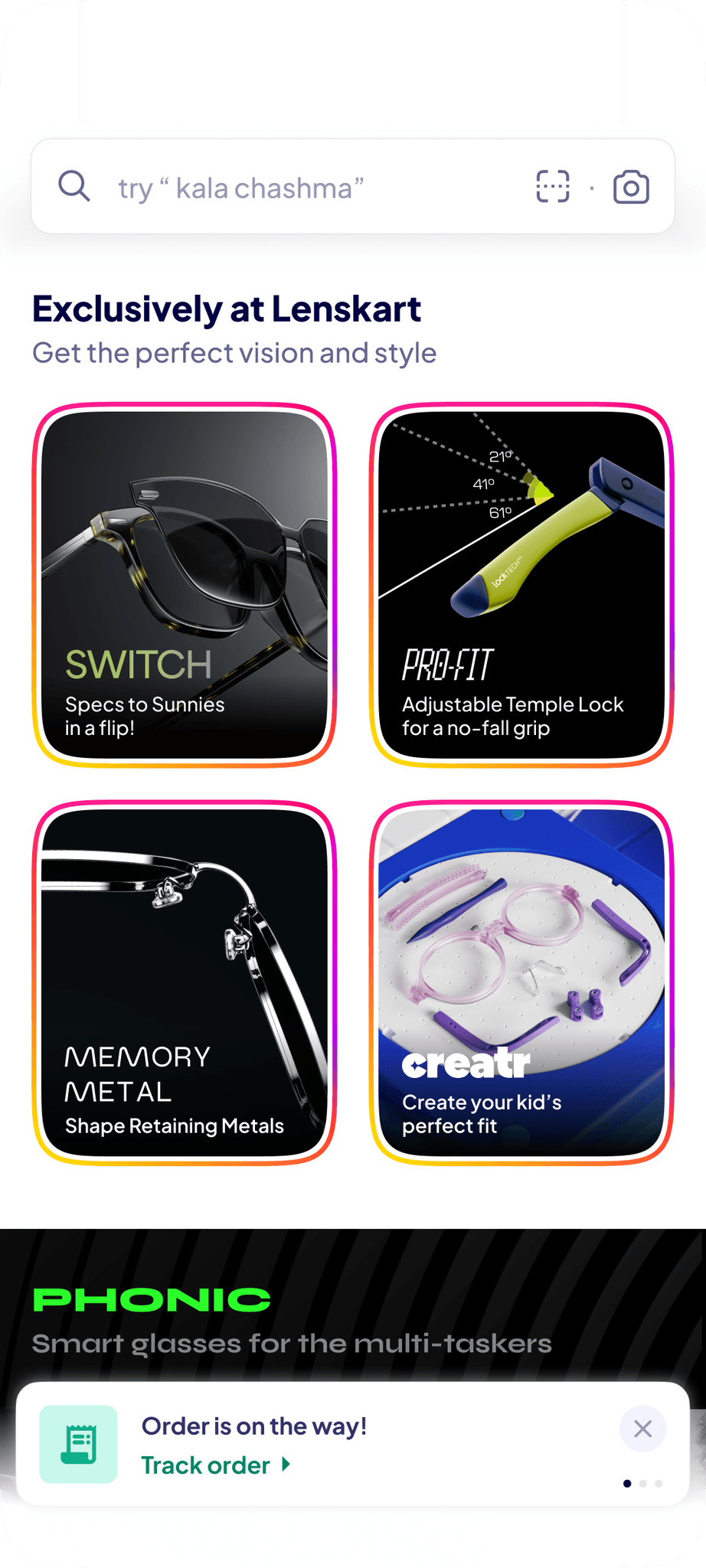
Surface GOLD &
AR Try on Visibility
What we Changed, and Why.
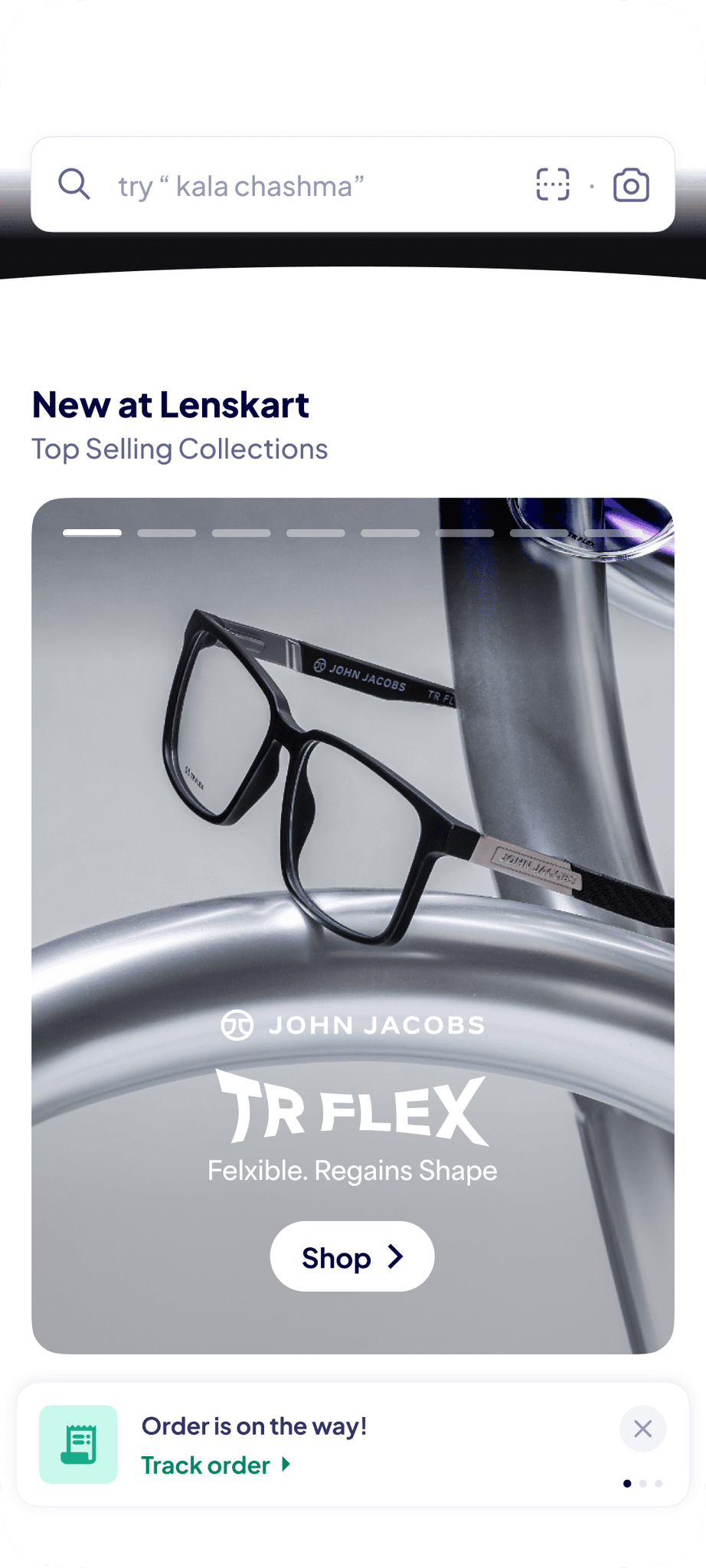
Core Grid, Reimagined
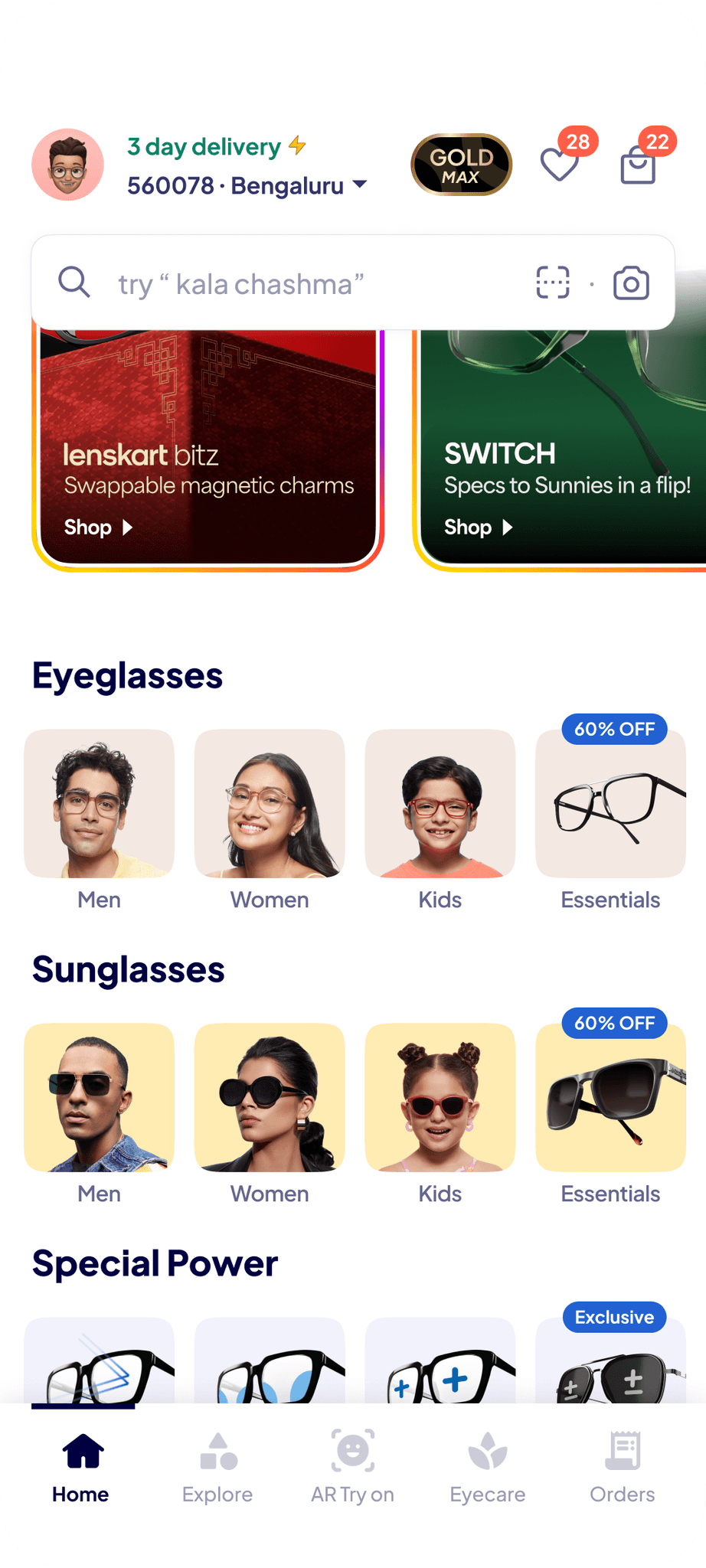
We rethiught the grid. Illustrations felt outdated, and real images brought products to life. Key categories like “Women,” “Kids,” and “Switch” needed more visibility. Every tile was under review — if it didn’t drive action, it didn’t stay.
Search, Found Again
Search had long felt like a secondary action, tucked away and only surfaced with intent. We had been testing new ways to make it more visible — always-on, always accessible. Two early concepts (v1 and v2) were prototyped: one minimal, the other bold and persistent. The hope was to reduce friction, helping users find what they needed without thinking twice.
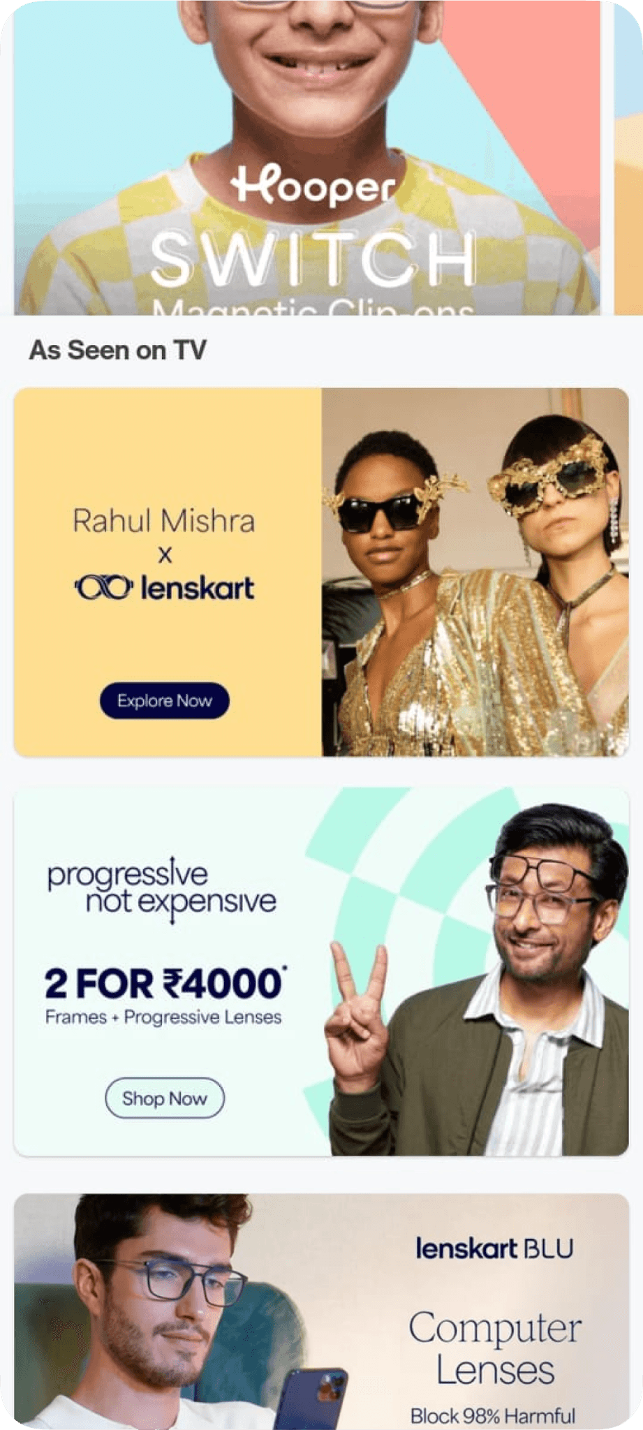
Lenskart Specials, Deservedly Promoted
Our in-house products had clear USPs but were lost in a generic carousel. We explored everything — upgrading the carousel, embedding Specials into the grid, or contextual placements — but all signs pointed to giving them a space of their own.
The Explore Tab, a series of 15 pages
We thought about lower-intent sessions — the casual browsers, the window shoppers. What if we gave them a space to simply explore? Ideas began forming around a new tab — a home for themed collections, celeb recommendations, bundles for different needs and occasions. We believed this could offer a sense of serendipity, while still guiding users toward discovery with purpose.
The Bottom Bar
We revisited navigation. Users needed faster access to essentials — Orders, Profiles, 3D Try-On, Search. A fixed bottom bar emerged as the simplest solution.
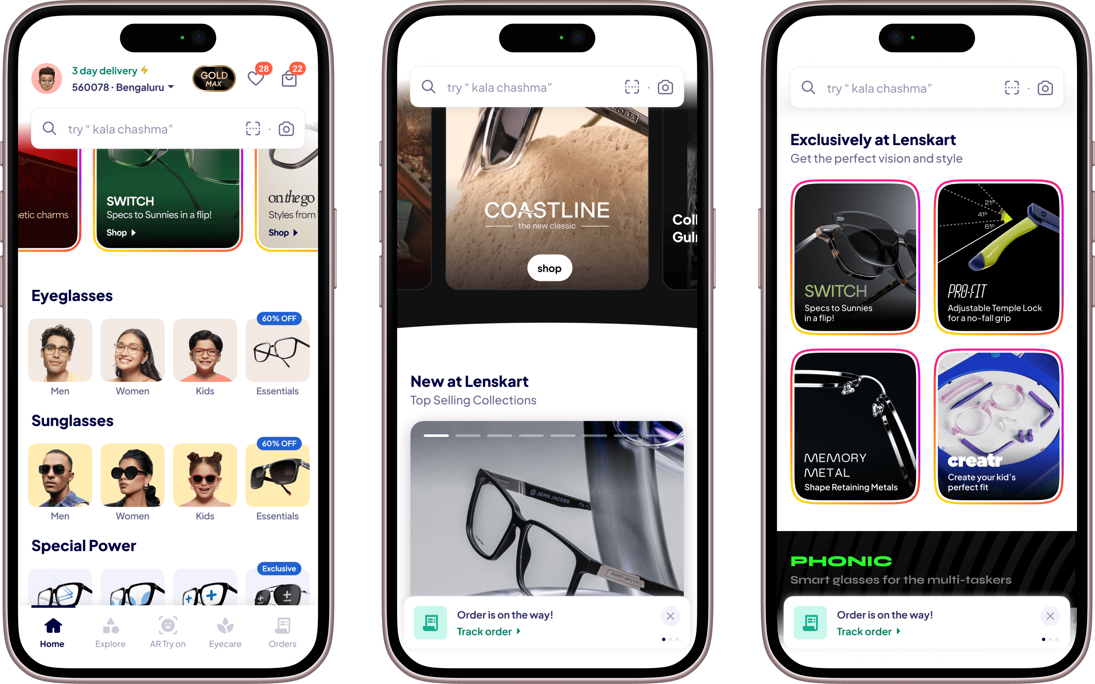
Key Screeens!


What we saw
The numbers were encouraging — but the behavior change
was more explanatory.
+10%
Overall Conversion
+11%
CTR on LK Specials
+14%
Home to PLP Journey
+15%
Homepage Engagement
+90%
AR Try on Usage
+40%
Explore to Order than home
A Homepage that listens
This was never about making the homepage “cooler.” It was about making it relevant again. To real users. With real goals.
Some come to buy. Some come to browse. Some come to be surprised.
Today, we meet them where they are. And we lead them to where they want to be.